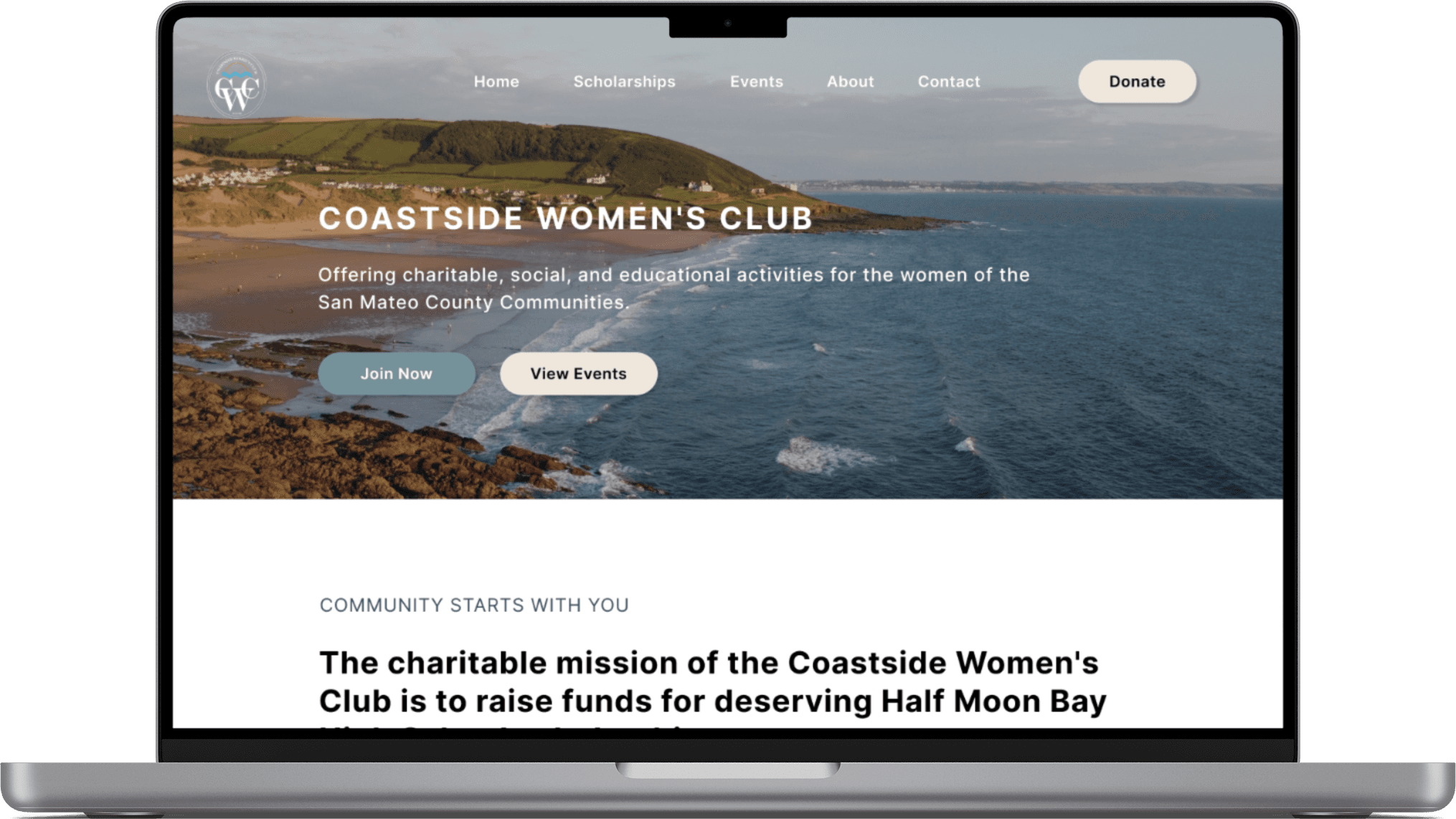
Coastside Women's Club
As part of a volunteer team through the organization 48in48, we were tasked with this website's revamp providing consistency as a modern, user-friendly platform that aligns with their brand identity.
The Coastside Women's Club (CWC) is a nonprofit in Northern California that raises funds through events and donations. Through their fundraising efforts, all funds go towards offering Half Moon Bay High School seniors scholarships to support their continuing educational goals.
UX/UI Designer
48 - 72 hours
Improve user experience by becoming more user-friendly and easy to navigate
Improve branding and visual design
Limited timeframe
Technical limitations: Developers built the website in Wordpress so the nonprofit could easily take over the control of it
Content limitations: Constrained by the client's existing content
A poorly designed or cluttered interface can confuse users and make it difficult for them to find what they're looking for, leading to frustration and abandonment
A lack of visual appeal can undermine brand recognition and consistency, making it hard for users to connect the website to the broader brand image
Lacking visual appeal
Leads users to doubt its credibility, professionalism, and relevance, causing them to leave quickly
Can result in high bounce rates (users leaving after viewing just one page) and low user engagement, as users may not find the site interesting enough to interact with
Mission & Community
Used clear and concise language to describe the mission and values of the nonprofit
Included photos of the team to showcase the community to increase engagement
Incorporated success stories & testimonials from scholarship students to show the contributors their impact
Donate & Join
Made the donation process easy to find and follow
Clearly communicated how the donations will be used and the impact they will have on the nonprofit's mission
Included a call-to-action to encourage visitors to join and clearly communicate the process
Upcoming Events
Created a dedicated events section to showcase upcoming fundraising events
Made sure the details of each event are easy to find
Considered including an RSVP or sign up process to help with any confusion
Reduced bounce rate: a lower percentage of users who leave the website after viewing only one page
Time saved: amount of time that users save when using the website
Reduced support requests: a decreased number of support requests or direct contact inquiries that are received after the solution is implemented
Positive user feedback: the level of satisfaction that users have with the website
By conducting stakeholder interviews, I was able to gain a deeper understanding of the client's needs, preferences, and pain points. In this particular case, I wanted to understand the client's vision for the website, including their desire for a consistent and visually appealing website that was easy to navigate for the 65+ community.
- Prominent links to donate, join, and, events
- Inclusive of club pictures on the website, as a way to embody the spirit of the community
- Focus of visual appeal and user-friendly experience for their 65+ target audience (not tech savvy)
When accessing a non-profit's website the three main call to actions are to donate, join, and participate in events which were all easily accessible
The website also had a consistent visual design theme throughout, showcasing their brand color as well
When entering their home page, first thing to look for is the mission statement which seems vague.
Cognitive overload: the page is full of clutter that can make it difficult for users to focus and it also makes it confusing to sort the important information from the rest.
The target audience of the Coastside Women's Club are current members, primarly women over the age of 65+. So I had to take into consideration how they would interact with the website, to make it the most easy and simple for them to navigate. I made sure to understand both their motivations for using the website and their pain points with their existing online presence.
I want to highlight the user-centered approach I took to prioritize the needs and preferences of the website's users. In discussion with the stakeholder, we came to an agreement on the sorting of information for the website. With more time, I would have liked to conduct a card sorting activity and usability tests with real users to understand how users interact and think about the information, as well as to validate those design decisions I had to make.
I organized and labeled the given content in a way that makes it easy for the users to find what they are looking for and understand the website's structural map
Finding the information needed on the website, can increase engagement, donations, and other forms of support
I designed 2 membership pages with a toggle to easily switch between the two sets of given information, either a 'New Member Sign Up' or a 'Membership Renewal'
Limited by developers that were unable to build the toggle, I opted to combine the pages
I created each website page wireframe in Figma, giving access to the engineers as we went along. I had determine the key information for each page, so I focused on creating a consistent layout to each. I wrote directions for the functionalities of the design elements to help the developers understand exactly what it'll perform.
I chose a color palette of blue and beige to convey a sense of community and connection, while also evoking the peaceful and coastal tone of Half Moon Bay. The color blue is often associated with trust, loyalty, and stability, while beige conveys a sense of warmth, calmness, and approachability. Together, these colors help to create a welcoming and inviting tone that resonates with the nonprofit's target audience. Additionally, I created a design system to ensure consistency and efficiency in the website design process. Although, I did not have time to prototype all elements into interactive components, so the elements created were limited.
Heading 1
H1: Inter, Bold, 40px
Heading 2
H2: Inter, Semibold, 32px
Body Text 1
B1: Inter, Medium, 28px
Body Text 2
B1: Inter, Regular, 24px
Accent text 1
A1: Inter, Regular/Uppercase, 24px
Accent text 2
A2: Inter, Semibold, 20px
Primary
#384D63
Primary
#75919A
Primary
#CBD9DB
Secondary
#CBA88B
Secondary
#EFE6DC
8px layout grid, 12 column
70 px width & 20 px gutters
Desktop 1440 x 1024
An unappealing design can affect the readability of the text, leading to strained eyes or confusion. So I incorporated accessibility features such as proper color contrast and typography choice for users with disabilities.
Color Contrast
3 : 1 for text 19px +
Line Height
1.4 Em

By having users sort information into categories, I could identify potential gaps or redundancies in the existing website navigation.
I would have liked to include this user-centered research method that involves users in the design process. This can ensure that the website meets their needs and preferences.
It was a challenge with the time constraint, that I wasn't able to prototype it out for the engineers building it to see how the designs interact and function.
I had to rely on my communication skills to give verbal and written directions to how the pages and buttons would all work together. We collaborated closely to understand the extend of the developers limitations.


